
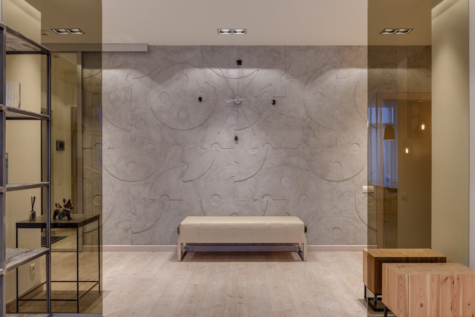
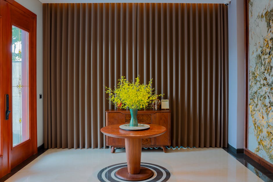
The architectural threshold of a home—the entryway—functions as a sensory filter, modulating the transition from the chaotic exterior environment to the controlled interior sanctuary. As the primary transition zone between the exterior world and the private living space, the foyer serves as a psychological and aesthetic threshold. Selecting the best paint color for an entryway requires a balance of optical physics—specifically how light interacts with pigment—and the mechanical requirements of a high-traffic environment. This analysis examines the technical specifications of leading paint products, the chemical composition of modern resins, and the architectural principles that govern successful color selection in transitional spaces.
The entryway is often the most neglected space in a residential floor plan, yet it bears the highest burden of first impressions. Beyond mere aesthetics, the choice of hue affects the perceived temperature of the home and the ease with which a guest navigates the interior. Data from architectural color consultants suggests that the most effective palettes are those that acknowledge the specific lighting conditions of the space, whether it is a windowless hall or a grand, double-height foyer with southern exposure. Furthermore, because entryways often lack traditional furniture, the wall color itself must provide the “visual weight” that anchors the room, preventing it from feeling like a hollow corridor.
How Light Reflectance Value (LRV) Dictates the Optimal Entryway Palette
In professional interior design, color selection begins with the Light Reflectance Value (LRV). This scale, ranging from 0 (absolute black) to 100 (pure white), measures the percentage of light a paint color reflects. For entryways, which frequently lack significant natural light sources, the LRV is the most critical metric for preventing a space from feeling subterranean or cramped. A common error in residential painting is selecting a color based on a small swatch without calculating how the lack of lumens in a hallway will depress the perceived brightness of that pigment. When a color with an LRV of 40 is placed in a windowless hall, it can visually “drop” to an effective LRV of 20, making the space feel oppressive.
For small or dark entryways, colors with an LRV of 60 or higher are generally recommended. These tones maximize available light, whether it comes from a transom window or an overhead fixture. However, the goal is not always maximum reflection. In larger foyers with abundant natural light, a lower LRV (between 10 and 30) can be used to create a sense of enclosure and intimacy, signaling a transition from the vastness of the outdoors to the security of the home. The physics of the space must precede the personal preference for a specific shade. This involves understanding the “Inverse Square Law” of light; as light travels away from its source (like a front door window), its intensity drops significantly, meaning the back of a long entryway requires a higher LRV than the area immediately adjacent to the door.
Consider the impact of undertones in these high-reflection colors. A white paint with a yellow undertone may appear dingy in a north-facing entryway where the light is naturally cooler and bluer. Conversely, a cool-toned gray can feel clinical and unwelcoming in a space that receives warm afternoon sun. The interaction between the color’s chemical composition and the Kelvin rating of your entryway’s light bulbs—typically 2700K for warm light or 3000K-3500K for neutral—will ultimately determine the success of the installation. Testing a large-scale sample (at least 24×24 inches) in situ is the only reliable method to observe these shifts throughout the day, as the angle of the sun changes the spectral distribution of the light hitting the walls.
Performance Evaluation of Leading Neutral and Statement Paint Tones
When selecting the best paint color for an entryway, professional decorators often default to a curated list of high-performance neutrals. These colors are chosen not just for their popularity, but for their stability across various lighting conditions—a quality known as low metamerism. Below is a comparative analysis of the most frequently specified entryway colors in the current market, including their technical specifications and practical limitations.
| Color Name | Brand & Line | LRV | Primary Characteristic | Approx. Price (USD) |
|---|---|---|---|---|
| Revere Pewter (HC-172) | Benjamin Moore Regal Select | 55.05 | Warm Neutral Greige | $78 – $88 / gal |
| Hale Navy (HC-154) | Benjamin Moore Aura | 6.3 | Deep Saturated Navy | $90 – $105 / gal |
| Sea Salt (SW 6204) | Sherwin-Williams Emerald | 63 | Muted Green-Blue | $94 – $108 / gal |
| Agreeable Gray (SW 7029) | Sherwin-Williams Duration | 60 | Balanced Taupe-Gray | $75 – $90 / gal |
| Chantilly Lace (OC-65) | Benjamin Moore Regal Select | 90.04 | High-Reflectance White | $78 – $88 / gal |
| Iron Ore (SW 7069) | Sherwin-Williams Emerald | 6 | Soft Charcoal Black | $94 – $108 / gal |
The Dominance of Warm Neutrals: Revere Pewter and Agreeable Gray
Benjamin Moore’s Revere Pewter remains a standard in the industry because it successfully bridges the gap between warm beige and cool gray. With an LRV of 55, it provides enough depth to hide minor scuffs while reflecting enough light to prevent a closed-in feeling. Pros: Exceptional versatility; works with both wood tones and stone flooring; high hide-power due to its complex pigment mix. Cons: In low-light entryways, the green undertone can become more pronounced, occasionally appearing muddy or “swampy” if paired with fluorescent lighting. It is best utilized in entryways with at least one natural light source to activate its warmer pigments.
Sherwin-Williams Agreeable Gray is its primary competitor, offering a slightly higher LRV of 60, making it a superior choice for narrower hallways where every percentage point of light reflection matters. Unlike Revere Pewter, Agreeable Gray has a more pronounced violet-pink undertone, which makes it feel “cleaner” in spaces with significant shadows. It is formulated with Sherwin-Williams’ Advanced Resin Technology, which allows for better flow and leveling, reducing the appearance of brush marks in the tight corners often found in foyers.
Saturated Statement Colors: The Case for Hale Navy and Iron Ore
For those aiming to create a “jewel box” effect, Hale Navy is a frequent specification. Despite its low LRV of 6.3, it functions as a neutral due to its balanced undertones. Pros: Creates a sophisticated, high-contrast backdrop for artwork and white trim; hides deep-seated grime effectively. Cons: Darker pigments in an entryway are prone to showing dust and “burnishing”—the shiny marks left behind when a bag or coat rubs against the wall. To mitigate this, a high-quality resin-rich paint like Benjamin Moore Aura is required. Aura uses “Color Lock” technology, where the pigments are microscopically bonded to the resin, preventing the color from rubbing off during cleaning.
Iron Ore (SW 7069) has recently surged in popularity as an alternative to true black. With an LRV of 6, it is incredibly dark but contains enough warmth to prevent it from feeling like a “void.” It is particularly effective in entryways with high ceilings, where it can be used on a single accent wall to provide a sense of architectural grounding. However, because it is a “near-black,” it requires a minimum of two coats over a gray-tinted primer to achieve the depth shown on the color card. Failure to use a tinted primer often results in a streaky finish that lacks the intended gravitas.
Maximizing Aperture: Chantilly Lace and Sea Salt
If the entryway is exceptionally small or lacks windows entirely, Chantilly Lace is often the technical winner. It is one of the “cleanest” whites on the market, meaning it has minimal gray or yellow tints. Pros: Makes small spaces feel significantly more expansive; provides a 90% reflectance rate, maximizing every lumen of artificial light. Cons: It requires a high level of wall preparation, as every imperfection in the drywall will be visible. Furthermore, its high LRV means it shows every fingerprint and scuff mark, necessitating a finish with high scrubbability ratings.
Sherwin-Williams Sea Salt offers a different approach, providing a subtle color that behaves like a neutral. Its LRV of 63 makes it bright, while its green-gray-blue composition adds a calming psychological element to the home’s entrance. In scientific terms, Sea Salt occupies a specific part of the color spectrum that the human eye perceives as “receding,” which can physically make a narrow hallway feel wider than it actually is. It is best paired with crisp white trim (such as SW Extra White) to emphasize its delicate hue.
Engineering Durability: Selecting Finishes for High-Impact Transition Zones
The best paint color for an entryway is only as effective as the resin system that carries it. Because entryways are prone to contact with moisture from umbrellas, oils from hands, and mechanical impact from shoes and bags, the choice of finish is as important as the hue. Historically, designers recommended semi-gloss for durability, but modern paint chemistry has evolved to provide high-performance finishes with lower sheen levels that offer equal or superior protection.
For most residential foyers, an eggshell or satin finish is the professional standard. These finishes provide a slight luster (typically 10-25% gloss at a 60-degree angle) that helps reflect light without highlighting every texture flaw in the wall. More importantly, they offer a tighter “film” than flat or matte paints, making them easier to clean. When a wall is wiped with a damp cloth, a flat paint may “burnish” or lose its pigment, whereas a satin finish is designed to withstand mild abrasion. In technical terms, the “Pigment Volume Concentration” (PVC) is lower in satin paints, meaning there is more resin available to encapsulate and protect the pigment particles.
In high-traffic commercial or residential entryways, consider using a scuff-resistant coating. Products like Benjamin Moore Scuff-X were originally designed for hotel hallways but have gained traction in residential foyers. This product uses a proprietary chemical formulation that prevents the transfer of material from objects to the wall, significantly reducing the need for touch-ups. It is available in matte, eggshell, and satin, allowing for a low-sheen look with extreme durability.
When evaluating paint lines, look for “washability” and “scrubbability” ratings, often measured by ASTM D2486 standards. A premium product like Sherwin-Williams Emerald Interior Acrylic Latex features a cross-linking technology that creates a harder surface once cured. While the initial cost is higher than contractor-grade paints, the lifecycle cost is lower because the interval between repaints is extended from 3 years to potentially 7-10 years. For an entryway, where the walls are touched daily, investing in a high-resin-count paint is a data-backed decision that preserves the aesthetic integrity of the color over time.
The Physics of Metamerism: Coordinating Bulbs with Pigment Chemistry
The most common reason homeowners are dissatisfied with their entryway color is a failure to account for metamerism—the phenomenon where two colors appear to match under one light source but vary under another. Because entryways often rely on artificial light during the evening and natural light during the day, the color will undergo a “spectral shift.” For instance, a neutral gray like Stonington Gray may look perfectly balanced at noon but turn a jarring shade of blue at 8:00 PM under a “Cool White” LED bulb.
To master entryway color, one must also master the Color Rendering Index (CRI) of the lighting fixtures. For the most accurate color representation, bulbs should have a CRI of 90 or higher.
- 2700K (Warm White): Enhances reds, oranges, and yellows. This will make “greige” colors like Revere Pewter feel much more beige and cozy.
- 3000K (Soft White): The industry standard for modern foyers. It provides a crisp look that doesn’t overly distort neutrals.
- 4000K+ (Daylight): This will emphasize blue and green undertones. If you use a color like Sea Salt under 4000K lights, it will lose its gray softness and appear as a vivid mint green.
Before finalizing a paint color, homeowners should replace their bulbs with the intended permanent fixtures to ensure the pigment responds correctly to the specific light wavelengths present in the hall.
Common Pitfalls: Why Entryway Color Strategies Fail
Even with the right color and finish, certain tactical errors can undermine the visual success of an entryway. Understanding these pitfalls allows for a more rigorous approach to the renovation process:
- Ignoring the Floor-to-Wall Interaction: The entryway floor is a massive horizontal “reflector.” If you have dark walnut floors, they will “bounce” brown light onto the lower third of your walls, potentially muddying a light gray paint. Conversely, light oak floors can make a cool white feel warmer.
- Neglecting the Ceiling: In a small entryway, painting the ceiling the same color as the walls (in a flat finish) can eliminate the “box” effect, making the boundaries of the room less defined and creating an illusion of height.
- Inadequate Surface Preparation: Entryways are often the oldest parts of a home and may have layers of old oil-based paint or wallpaper residue. Using a high-quality bonding primer (like Zinsser B-I-N or Kilz Restoration) is essential to prevent the new color from peeling or showing “ghost” stains from previous inhabitants.
- The “Flash” Effect: This occurs when paint is applied too thinly or over patches that haven’t been primed, causing the sheen to look uneven. In the direct sunlight of an open front door, “flashing” becomes highly visible and distracting.
The Strategic Influence of Entryway Color on Property Perception and Value

Does the color of your entryway impact the market value of your home? Real estate data consistently indicates a correlation between neutral, high-quality interior finishes and faster sales cycles. The entryway provides the “anchor” for a potential buyer’s emotional response. A neutral palette—such as soft grays, warm whites, or muted taupes—allows the buyer to project their own furniture and lifestyle onto the space without the cognitive load of processing a jarring or highly personal color choice. According to Zillow’s 2023 paint color analysis, homes with “greige” or light blue entryways sold for a premium compared to those with stark white or bold primary colors.
From a psychological standpoint, the entryway should facilitate a “decompression” effect. Bright, aggressive colors like reds or oranges can trigger a physiological stress response, increasing heart rate and cortisol levels, which is counterproductive in a space intended to welcome residents home. Instead, the use of “transitional” colors—those that appear to change slightly depending on the light—creates a dynamic but soothing environment. This is why colors like Sea Salt or Revere Pewter perform so well; they feel alive and responsive to the environment rather than static.
Furthermore, the continuity of color from the entryway into the adjacent rooms can create an optical illusion of greater square footage. Using the same color, or a shade just one step lighter or darker on the color strip, eliminates the visual “breaks” that make a home feel fragmented. For homeowners concerned with long-term value, a cohesive color strategy that starts at the front door and flows logically through the main living areas is the most effective approach. This does not preclude the use of accent walls or bold colors, but these should be reserved for areas where the eye is meant to rest, rather than the primary path of travel. By prioritizing LRV for light management and high-performance resins for durability, you ensure that the first room of your home remains as functional as it is inviting. The investment in premium materials and a calculated color choice pays dividends in both daily satisfaction and long-term property maintenance.

